snowman granola bars
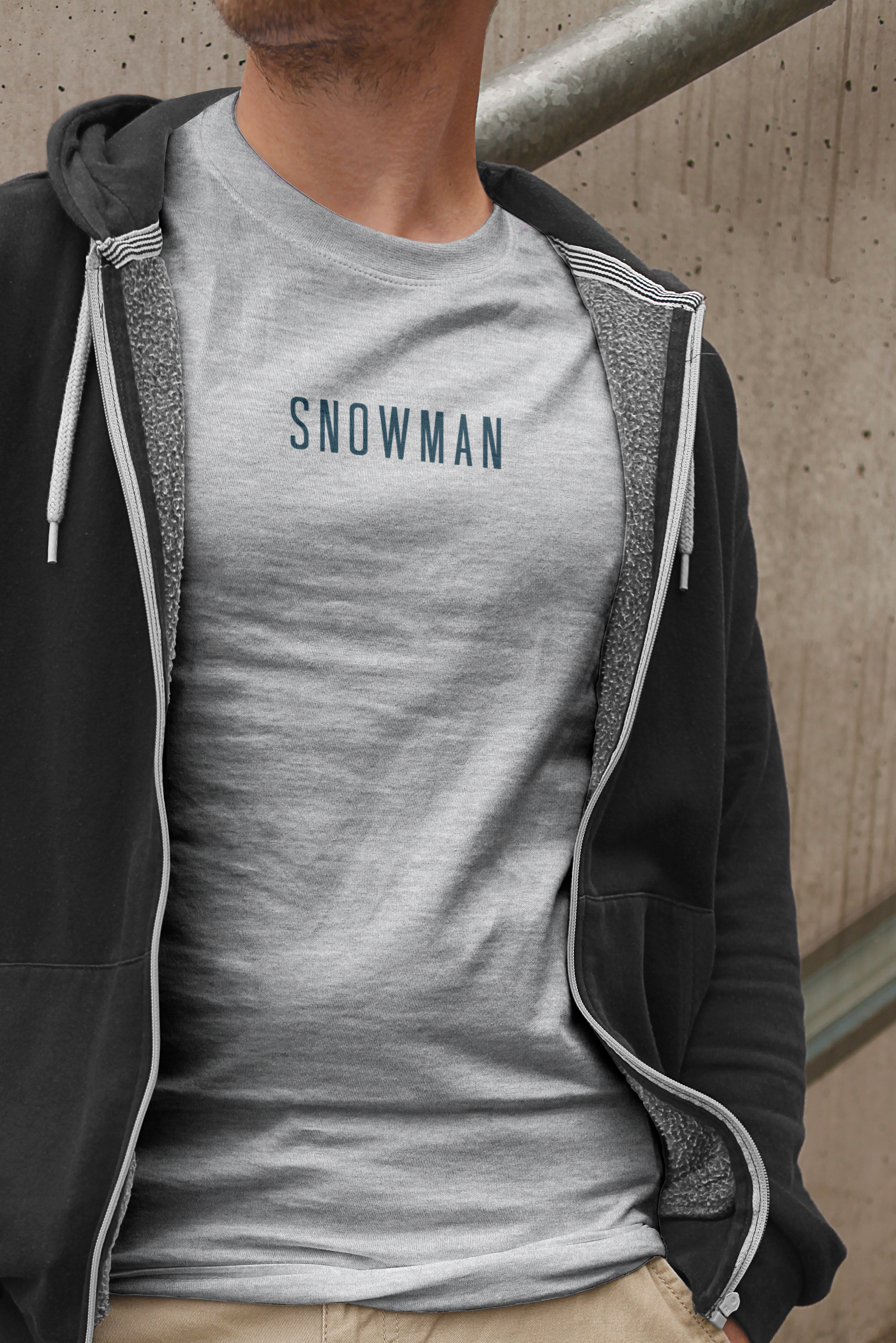
Snowman was never meant to fit in. In a category obsessed with earth tones and handwritten fonts, this brand was designed to break the mold entirely, and be a granola bar that feels like a high-fashion experiment, or at least a product with the damn confidence to exist on its own terms. Every design decision, from the stark contrast of energetic, colorful packaging to the precise, modern typography, was made to create a brand that feels premium without trying, bold without being loud.
This isn’t just a snack: it’s an artifact. Snowman was built with the idea that less is more, that a great product shouldn’t have to explain itself. No forced marketing, no over-the-top claims — well, one about evil — just an identity that speaks for itself. The packaging is almost cinematic, the kind of product that looks just as good on a shelf as it does in motion. This was intentional to make certain that Snowman is a study in restraint, proving that in design, the quietest brands often have the loudest presence.


